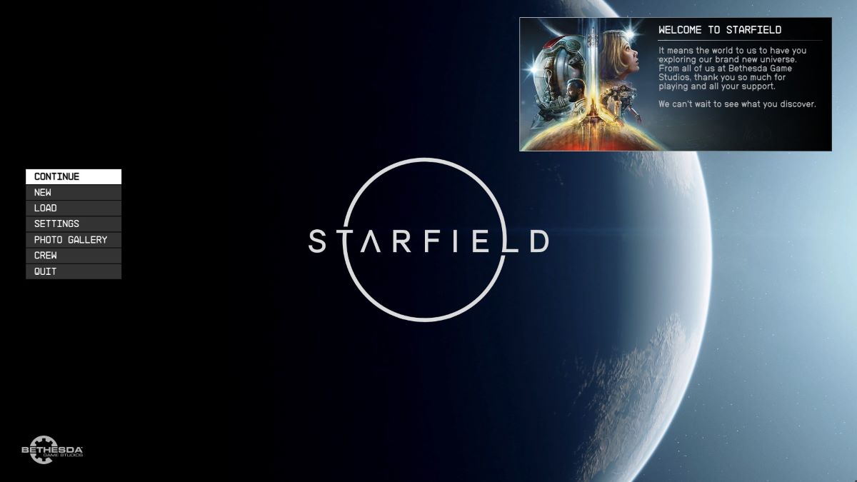
Another week, another weird blip in video game discourse, this time courtesy of Starfield. It’s an open secret that reviewers have their hands on the near-final build of Bethesda’s latest, but they’re supposed to be under strict embargo. Apparently, some people missed that memo, though, and the start screen of Starfield — of all things — has been at the center of a new controversy about development teams and priorities.
Why Are Some People Mad About the Start Screen of Starfield?
It’s been clear for years that Bethesda Game Studios is pushing to make Starfield its most polished title to date. In development since 2015 and first announced in 2018, the game has suffered two very public and much talked about delays. The first saw it pushed from its original November 11, 2022 date to the first half of 2023, while the second finalized its current September 6, 2023 launch. These delays reportedly saw Microsoft leveraging its engineering workforce to ensure the game has a smooth launch.
Furthermore, the team has been pushing to the very last minute, announcing that Starfield had gone gold — or locked in its launch build — just one day before pre-loads began. Maybe that last fact lends credence to the argument at the heart of this new controversy, which is that the team either ran out of time or simply couldn’t be bothered to put together a good start screen.
The debate began with Mark Kern, a former producer on Diablo 2 and serial controversy magnet. Kern, an X Blue subscriber, took to X over the weekend to state that “Starfield’s start screen either shows hasty shipping deadlines by a passionate team overworked, or a team that didn’t care”:
The physiognomy of start screens.
The start screen of a game can reveal a lot about how rushed the team was and how much pride they took in their work.
Starfield's start screen either shows hasty shipping deadlines by a passionate team overworked, or a team that didn't care. pic.twitter.com/Ok4gzQ3DVo
— Grummz (@Grummz) August 19, 2023
There’s no denying that the screen isn’t flashy. It’s a basic menu and a notifications window set against the backdrop of the game’s gorgeous key art. Intentionally or not, it’s a minimalist approach to menu design, at odds with the seemingly common wisdom that menus should be dynamic.
What Happened Next?
Gamers and developers alike flocked to Kern’s post to weigh in on his assertions that start screens are often made at the end of the cycle and can, therefore, be used as a barometer for the state of development. The most frequent response has been to highlight other games with similarly stripped back menu screens, including Skyrim, Elden Ring, and Red Dead Redemption II to suggest that there’s no inherent correlation between the introductory menu and the factors Kern mentioned, much less that a team that is proud of its work will redo that menu for a day-zero patch.
Some developers have argued that Kern is wrong on principle and that the start menu is a fundamental part of in-game UI that is iterated and designed throughout development or that getting it right early is “a team booster.”
However, the most damning response comes from Pete Hines, head of Publishing at Bethesda Softworks, who said that the screen was “one of the first things [they] settled on,” before issuing a takedown of Kern’s lack of professionalism:
Or they designed what they wanted and that’s been our menu for years and was one of the first things we settled on.
Having an opinion is one thing. Questioning out a developer’s “care” because you would have done it different is highly unprofessional coming from another “dev”
— Pete Hines (@DCDeacon) August 20, 2023
Is That the End of the Controversy?
If not a comprehensive response, it’s one that rings of finality, and hopefully it’s enough to end the whole debate. But it probably won’t be and, moreover, it only really serves to prompt more, similarly vacuous outrage takes in the future. As X tries to coax more users to sign up for X Blue by paying some subscribers based on engagement, we’re only going to see more of this kind of engagement bait ramp up. The best way to combat it is to starve it of oxygen. Unfortunately, that’s never going to happen on social media, but maybe if we can move enough of the conversations away from the platforms early, we can contain them and stop promoting them.
Maybe that’s just wishful thinking, though. Either way, the controversy around the Starfield start screen is an absurdity that’s already gotten way more attention than it deserves. I think the UI is remarkably clean and seems simple to navigate, which makes it more pleasant than one bloated with store links and unclear signposting. Besides, Bethesda has used the minimal approach before for some of its most beloved games.
And with that, let’s consider the matter closed, and hopefully I’ll never be inspired to write another word about how someone is upset over a damn menu screen.